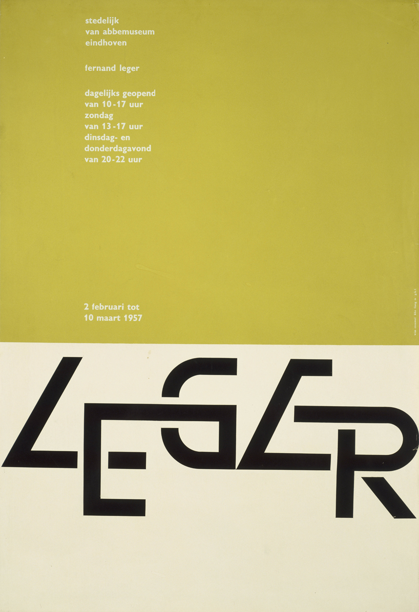
I went to the excellent Wim Crouwel exhibition at the Design Museum yesterday and I thought I would share my musings with y'all.
Coming from an architectural education, I was always confused about what was so special and unique about graphic designers. I mean, we all had to lay stuff out, pick colour palettes, use specific fonts, except that us architecture students had to design the actual 3D thing that was going to be represented in the beautifully laid out sheet. All they had to do was make a pretty pattern and pick colours. Graphic Designers. Wasters.
Over the course of the last year I have been working closely with graphic designers and they are a particular breed. Controlled, obsessive to the point of OCD and whimsical. Its actually pretty amazing to see one work up close, because only then do you realise that you can never do what they do. You'd go mental spending moving stuff around on Illustrator for two days straight like a cryptographer trying to decipher a puzzle and then at the end, they produce something so beautifully composed that it makes all your monkey-fisted attempts at sheet layouts look like scrawlings made by a blind toddler.
Wim Crouwel is one of these people, except he was doing this shit without the luxury of computer aided programs and with very little precedent before him.
I could go on about how influential he has been to modern design since the late 50's, his outstanding 30 year body of work he did for the Stedelijk Museum in Amsterdam and his time as the founder of Total Design studio in the 60's. Rather, I'm going to focus on arguably his most influential and famous work.
What was truly awe-inspiring was his creation of the New Alphabet. When Wim saw what traditional text looked like on then-revolutionary Cathode Ray-based phototypesetting screens, he was not happy. The limitations of the equipment meant that curved lines suffered under the limited resolution, making it look horribly pixelated. Solution? New font, one that is specifically constructed to deal with the machine, made of only horizontal and vertical lines. Public reaction? something along the lines of 'what the fuck'. Because it was so far removed from anything at the time, his fellow peers were outraged. It sparked public debate and it encouraged others to create their own typefaces, practically rejuvenating typography into a new digital world. Does it look familiar? Probably, because it was the font used on the cover of Joy Division's Substance album.
I cant be arsed to put more images of this amazing man's legacy of work, but definately check it out. I'm sure you will come across stuff that you've seen before. Oh, and go to the Design Museum for the exhibition and get some fucking culture in you, you layabout.
AL//